A
One...


- It's when you have three important colors in your frame (or area) that set the mood of the scene you want to capture.
For example, the image on the right.
Instead of overflowing the setting with red roses and anything pink, you see that brown-beige color in the background that makes the environment feel natural. & Whith the white carpet that leads to the couple standing at the other end of the space & the chairs that rest behind them, you get a feeling of how delicate that moment is. At the same time, there's that orangish-yellow color illuminating from the candles that provides a nice little accent to the scene.
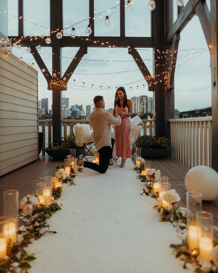
*Now, of course there are other colors in the picture but, the ones that I highlighted are the ones that really matter & make that moment so intimate.*
If it costs you your peace, it's too expensive!!!
Trying to set a relaxing, peaceful mood with these colors can happen naturally everyday. All you need is sunlight! Golden hour is one of the best times to get these exact colors but, any sunlight would do.
For example, this photo I took in New Haven, CT.
Normally, people don't think of cities as peaceful places but, with the sunlight glistening off of the brown-beige buildings & the cloudy-white sky leading out into the horizen, there isn't a more peaceful image of this city during the pandemic.

Autumn is the mosaic of seasons!!!
With all of the colors that Fall brings, its not hard to see how these three can make a home feel like the season is indoors.
The aesthetic of this image itself screams autumn, but if you switched the colors & everything became blue, grey, & white, it would feel less like fall & a lot like winter!
